Design for Travel
Over nine months I redesigned Staynex’s travel booking platform end to end, expanding a basic hotel booking system into full flows for flights, bundles, tokenized rewards, Web3 payments, and the marketing site that sells it all.
What I did
End-to-end design of booking flows (hotels, flights, bundles)
Design of travel pass integration
Loyalty points dashboard and reward redemption flows
Marketing landing page
Design of AI Travel Concierge
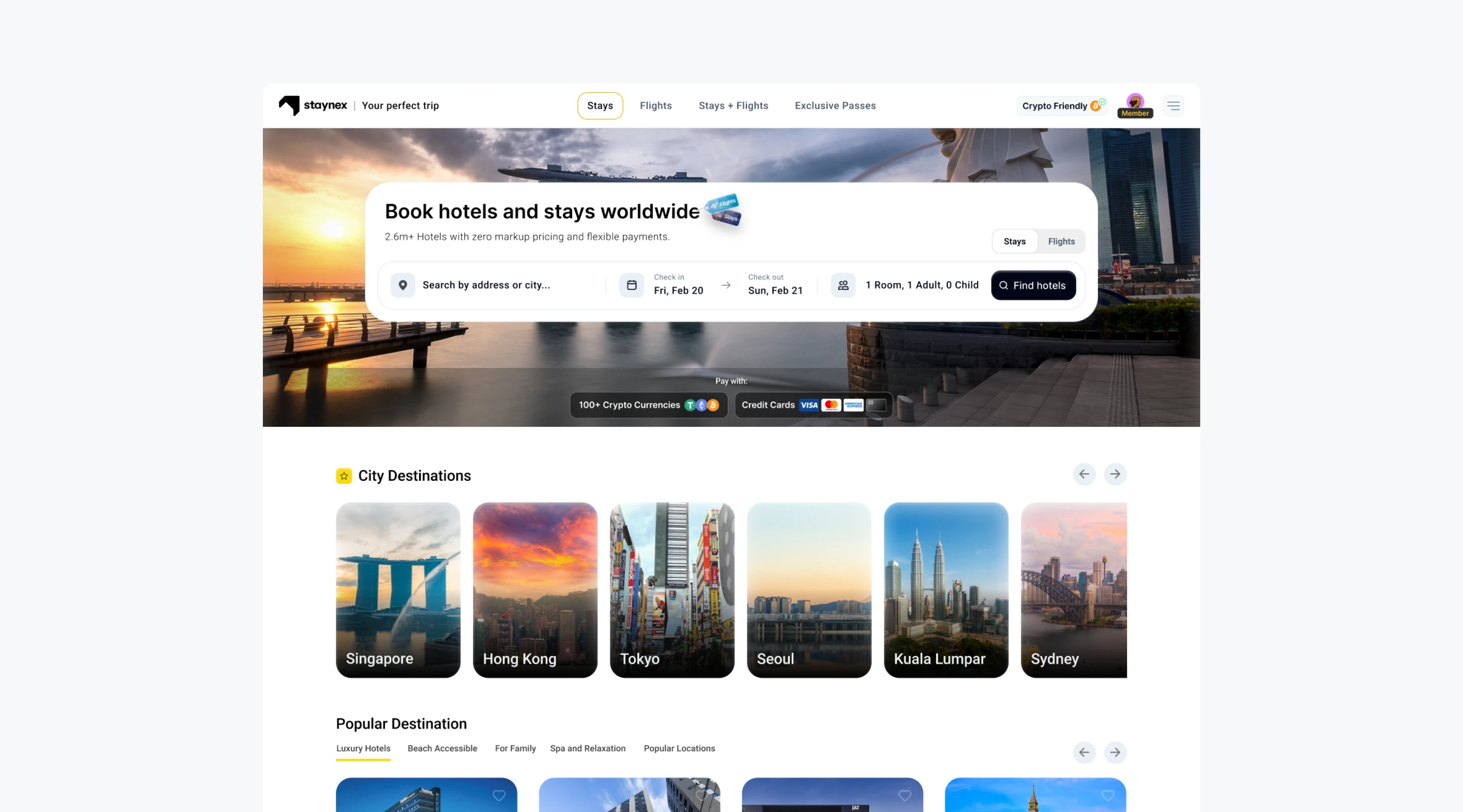
A travel booking platform
that requires a payed subscription
Staynex is a travel booking platform thats built around a subscription model. For a yearly fee, users unlock zero-markup pricing on hotels, flights, experiences all while earning tradable STAY tokens that are redeemable for future discounts and vouchers.
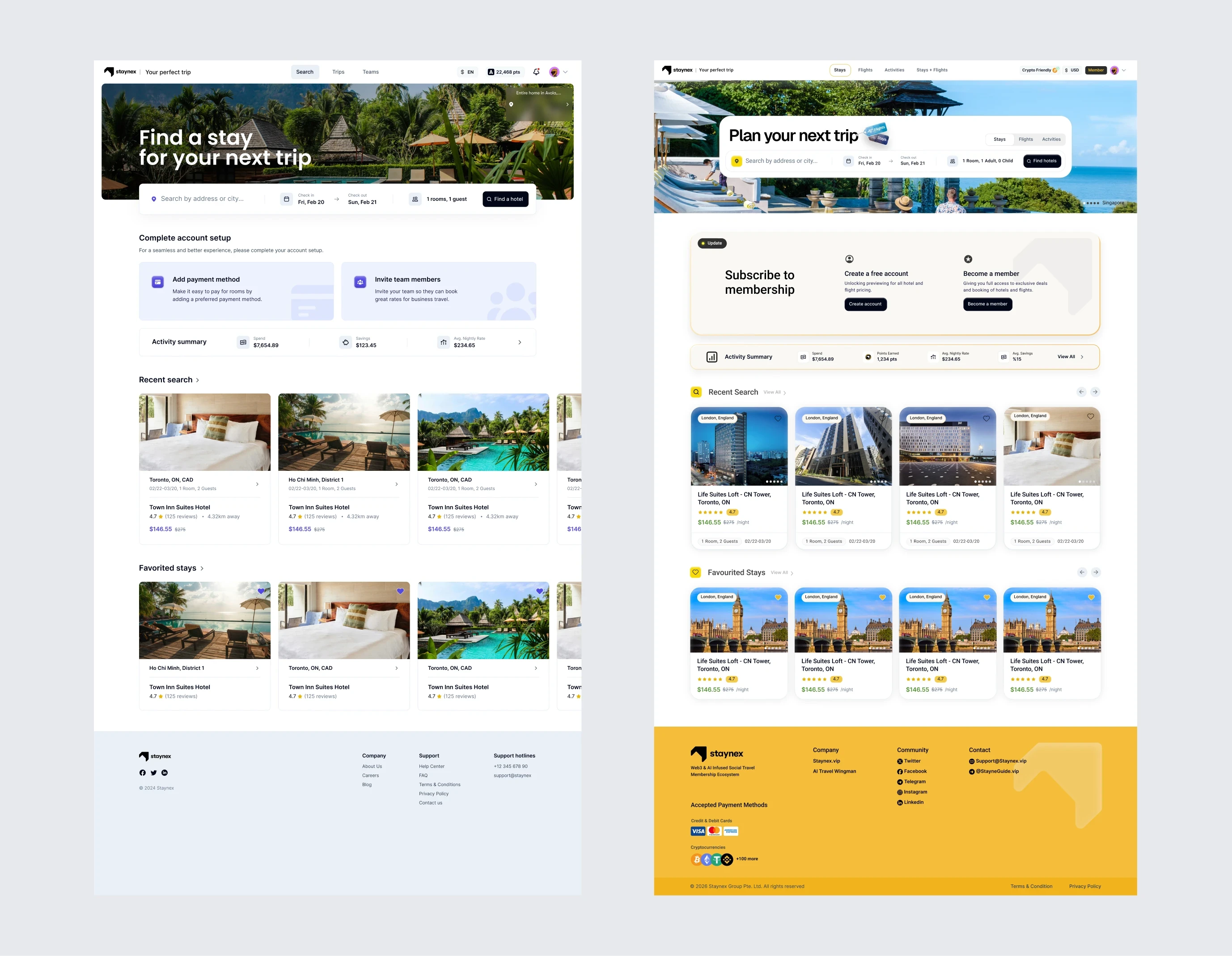
Before we started working, Staynex already has a templated travel app with basic hotel booking functionality. They needed to expand they're app to accomodate all they're new features the old app lacked.
Objectives of work
A
Full design refresh of existing app into a modern travel booking platform which holds its own against giants like booking.com and Expedia.
B
Inform users on the value of a subscription for travelling compared to other booking sites that are free.
C
Grow into a full booking platform with flight, hotels, bundle booking,s AI travel planner, and web3 rewards integration.
Old booking platform
Redesigned booking platform
Feel like a booking giant &
justify a membership at the same time.
Staynex’s target users were travellers who were already familiar with other booking giants like Expedia and Booking.com, who are platforms with no subscription payment and marketing on membership value. Staynex on the other hand had to serve two objectives that pull in opposite directions:
First Objective
1
Book trips as fast and fictionless as the big names with familiar booking patterns.
Second Objective
2
Show why booking through a subscription is worth it without looking like a marketing page.
Pages mixing function with promotion
Pages focused on function only (booking)
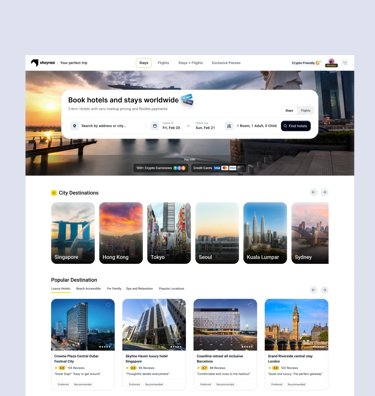
Booking platform home page

Hotel search results
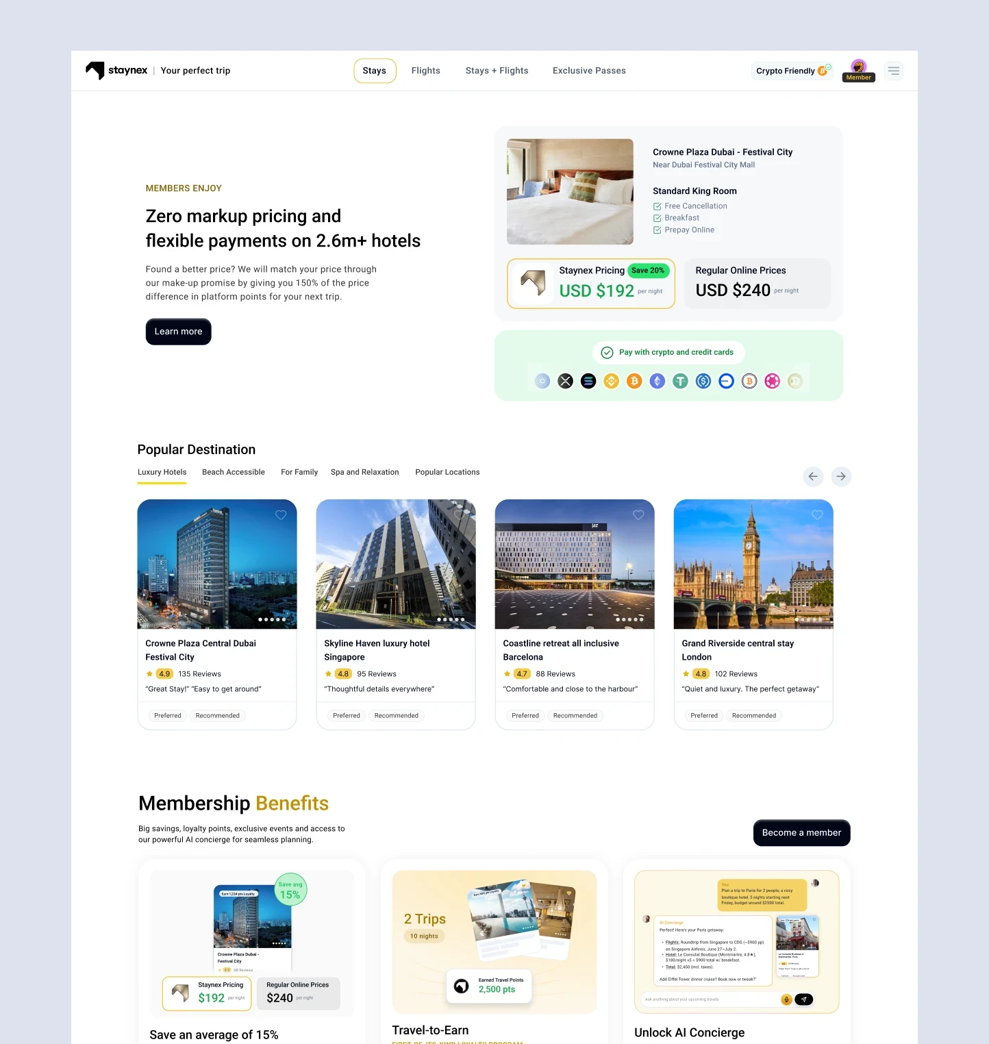
Middle sections of home page

Booking flow final step

Flights home page
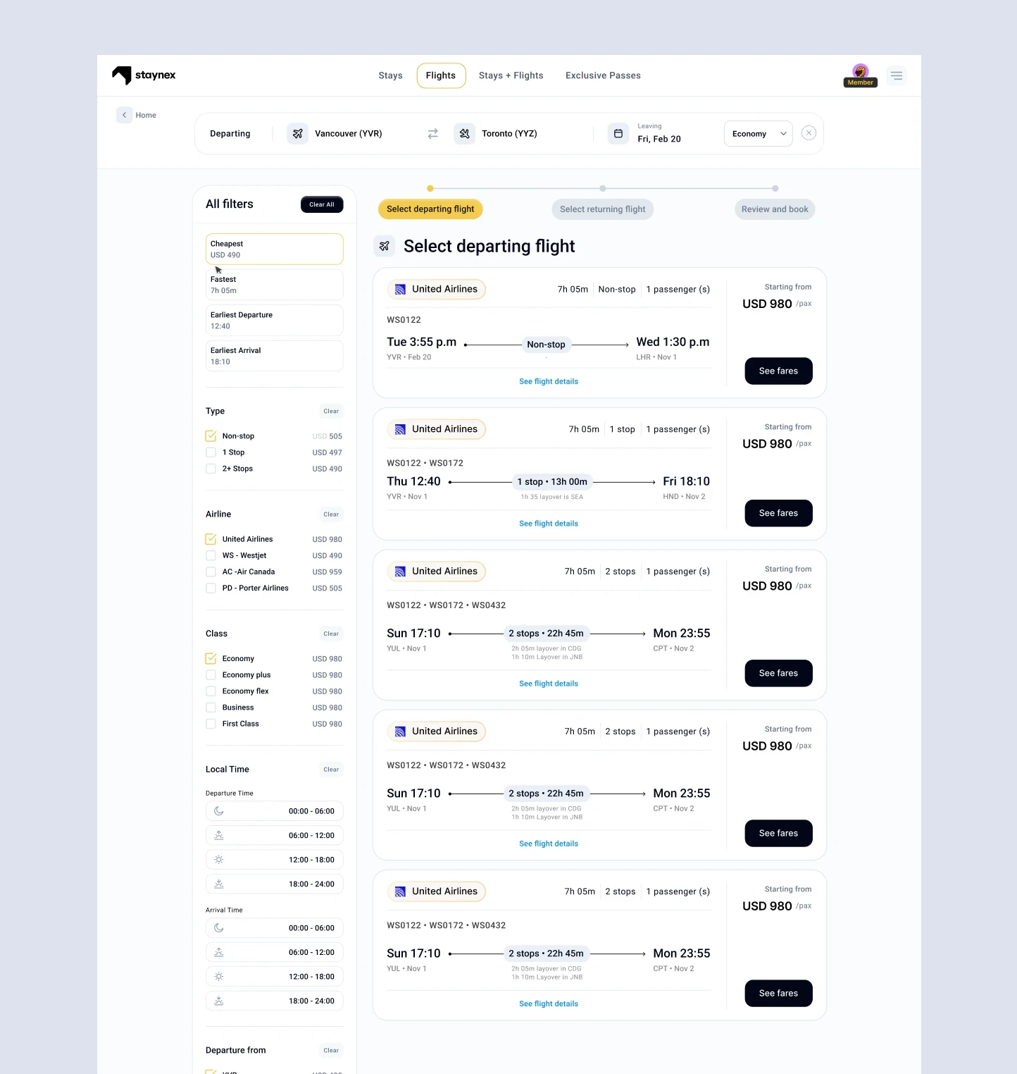
Flight search results
What I worked from
A combination of stakeholder feedback and competitive teardowns.
Stakeholder Relayed Feedback
The project owner's observation: Users of previous platform did not understand the subscription's value.
Deep competitive teardowns
I studies how Booking.com and Expedia structure information density and handling complex utility flows like booking multi-city flights through one search.
Work sessions with lead dev and product manager
Met with team to go over feature requirements in the PRDs and walking through engineering limitations and aligning on goals before starting on designing screens.
Frame the membership as ROI,
rather than a paywall for membership access
Initially, a subscription can feel like extra costs until the math is made obvious. I designed a section on the booking platform which breaks down the numbers of one year of travelling booked through the normal booking platforms compared to booking through the Staynex subscription.
The math clearly shows how the subscription not only pays for itself, but results in a large extra savings alongside all the membership benefits.
Design Requirement
A
The user needs to grasp why paying the subscription is better than booking for free.
B
The user needs to understand the membership pays for itself, and then some.
Showing average booking savings


Membership perks scattered across relevant moments
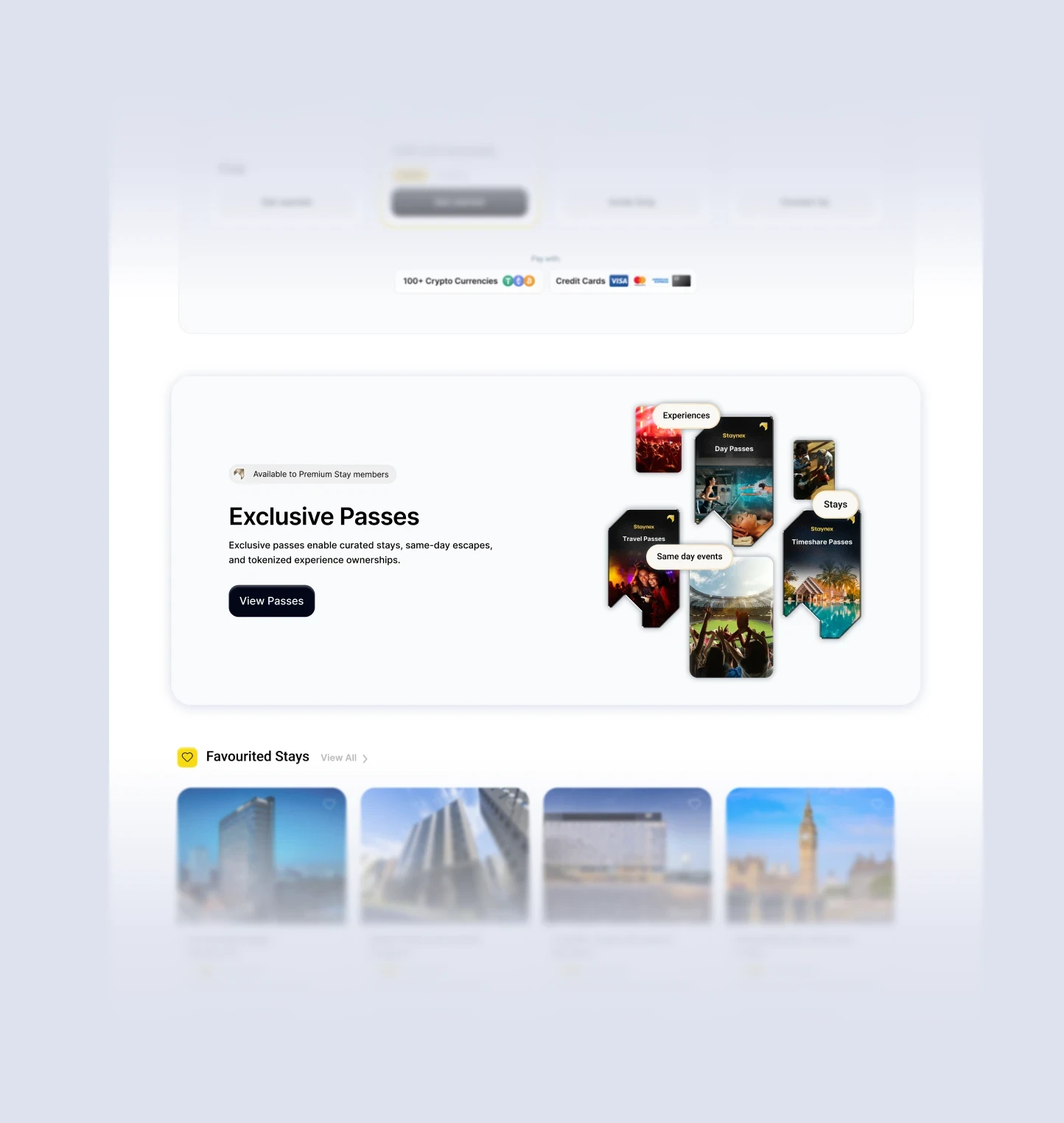
Promotion banner for exclusive passes on home page
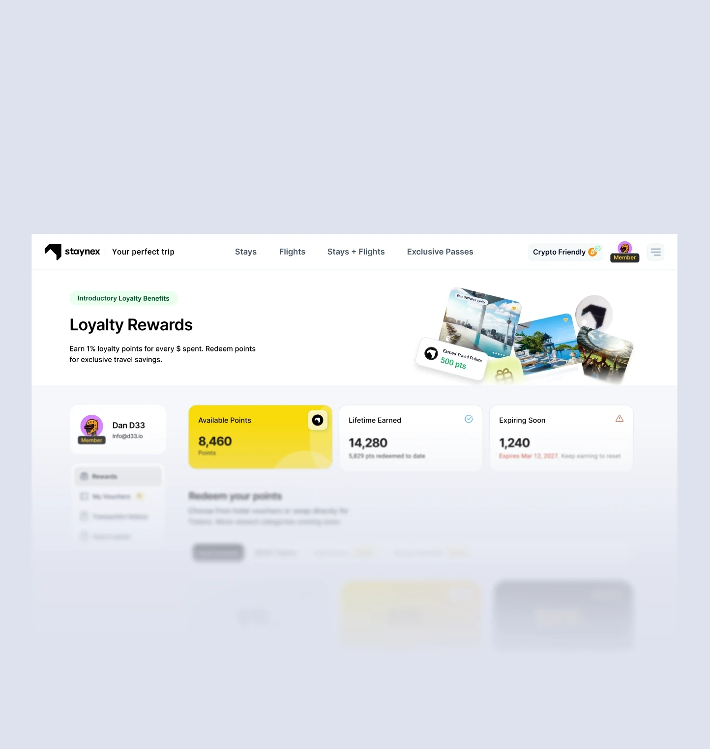
Member benefits featured on loyalty points page

Seasonal promotion banner featured on home page
Designing to ship by
optimizing to development capabilities
Early in the project I started to notice a gap between my design files and what landed in the front end. My early designs for Staynex featured a lot of layers gradient borders and soft shadows which the font-end team could not accurately execute.
Solution
Adjusting to a simpler flatter design which can be built more accurately.
The new flatter visual language was made with the same style as the original design but with less layered effects, simpler alignments, and clean borders rather than shadows. These were better executed by the front end team resulting in an increase in production quality.

Front end notes embedded in design files
My first handoffs were Figma frames on a grid, which I assumed would translate perfectly. They didn’t. I started shipping max-width constraints and breakpoint behaviour with every screen. For complex layouts like search results (filters + map + fixed-width result cards), explicit notes for how the layout resolves at each screen size.

Annotated handoff. Search results at 15″ and 13″, with max-widths, sticky behaviour, and card constraints documented in the file.
“A restrained design executed at 90% beats
a beautiful one executed at 70%.”
Creating a post-production loop
Without a structured post-production review and refine process, the sync between my work and the engineering work started to stray apart slowly. Engineering often worked on a different timeline such that my delivery of work was often weeks ahead of engineering implementation. As a result, the shipped product missed visual details relative to the design in small areas that accumulated across the platform.
Without a deliberate cycle to review and reword these details, the product build ended up not meeting the quality of the delivered designs. Next time, I would implement a post-production loop built into the production roadmap where I would review and approve the build implementations before they get shipped.
The lesson
With teams that ship fast, a post launch design check has to be built into the definition of done.