Designing for Product Clarity
Chekkit is a business messaging platform with around 11 features in one software. Its website previously tried to show all of them at once, which meant a visitor could read the whole homepage and still not know what the company sold at its core.
In this project, I rebuilt the entire website around 4 core features with a focus on hierarchy of what to include and what to demote for an overall lighter more cohesive website experience.
Scope
Full site redesign and Webflow build
New design system
New information architecture
Custom UI animations
Rebuilt UI graphics
Enhancement of product UI
Who I worked with
I collaborated with one of Chekkit's cofounders who set priorities, supplied product knowledge, and gave final approval on every stage.
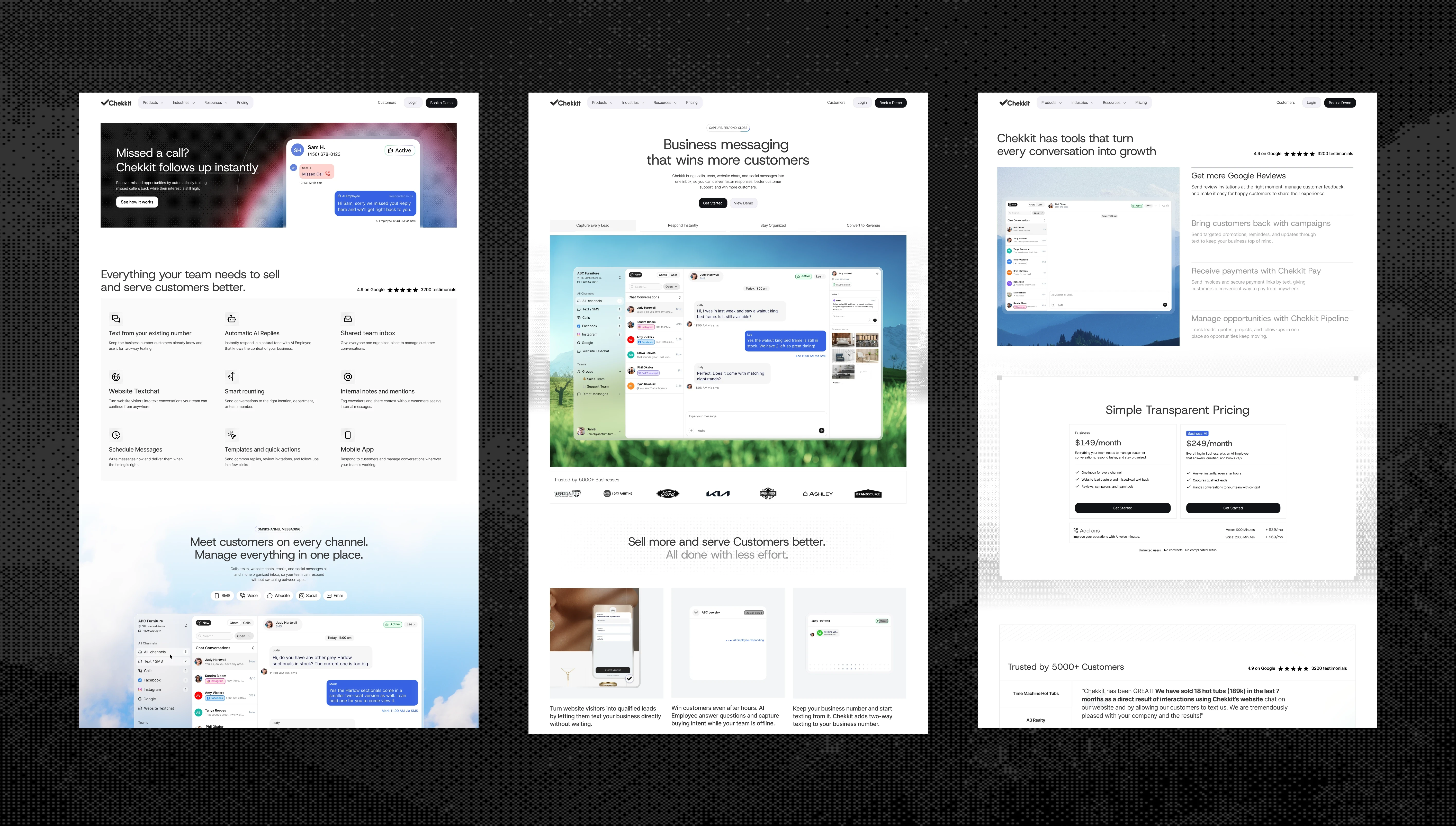
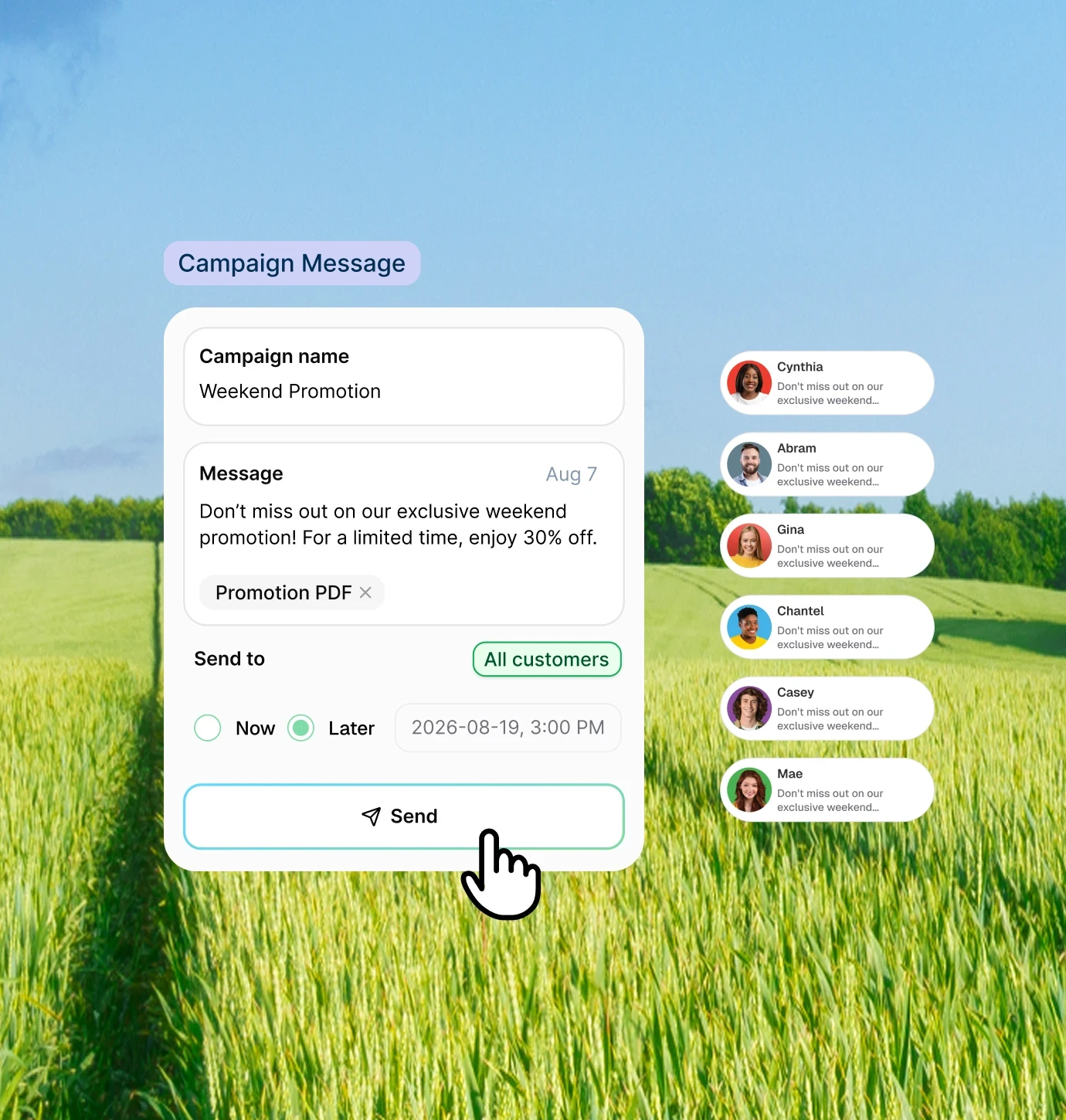
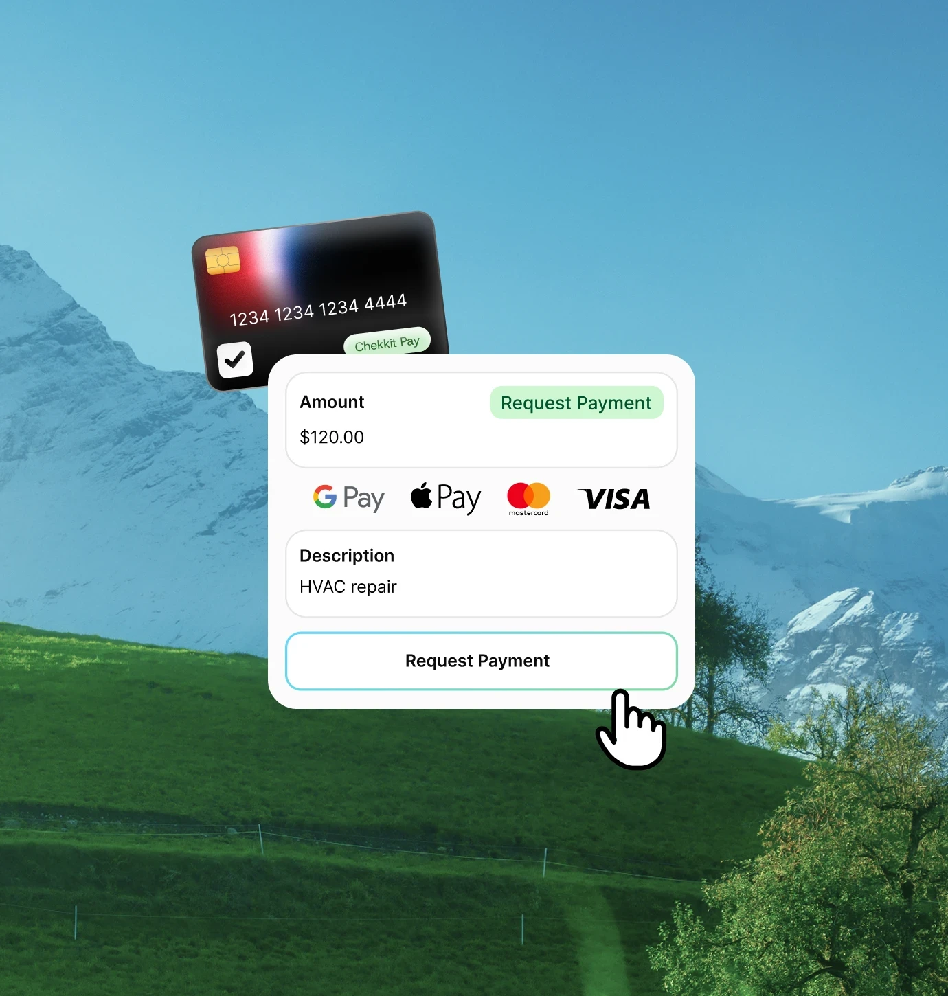
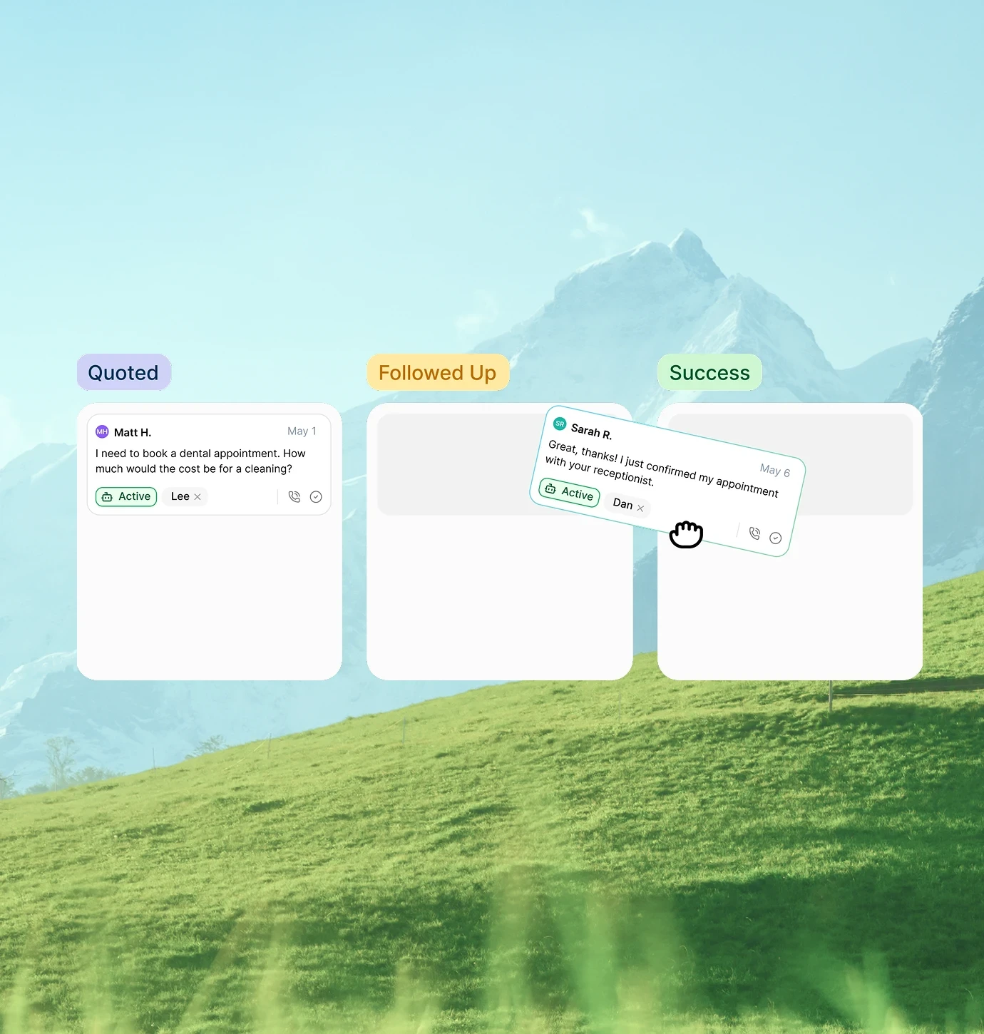
Snippets of website sections and graphics created for Chekkit.
Chekkit's old website tried
to communicate everything at once.
Chekkit's old website tried to introduce all 11 features on one home page without any real focus and hierarchy. Although the features were somewhat related, it was hard for viewers to understand what Chekkit core value was.
From the user's point of view, extensive reading was required to Chekkit's big picture.

Core issue
Trying to communicate too much at once meant the core value was drowned out and nothing stood out as the leading selling point.

OnePay Iconography
Choosing what features
to prioritize and what features to demote
First objective of redesigning
1
Users need to quickly land on a core idea before being introduced to more.
First objective of redesigning
2
Users must understand both the capabilities and benefits of Chekkit's core features.
"The core value proposition has land immediately for the rest of the features to follow up and make sense."
What I worked from
A combination of advisory insights and tools, user research, competitor analysis.
Brainstorming with cofounder.
Collaborating with the cofounder built the foundation of core issues and priorities of what to work on. All work was ran through the cofounder for approval.
Feedback from Chekkit team.
After shipping big updates, the full founding team at Chekkit reviewed the work and provided feedback on areas that needed improvement and areas the needed to be reworked. Most of the rework was content related.
Competitive analysis of top CRM websites.
The cofounder and I looked through some of the top CRM websites like Fin, Intercom, Chatbase, etc. I teared down these websites, studied their structure, and took note of what made their branding and messaging effective.
Positioning Chekkit's core
value as "Business Messaging"
Improvements to information structure
A
Focusing on business messaging as the core feature.
B
Improving hierarchy of features to prioritize features complimentary to business messaging.
C
Demoting smaller supplementary features and grouping them together in a smaller section.
New information structure
Old information structure


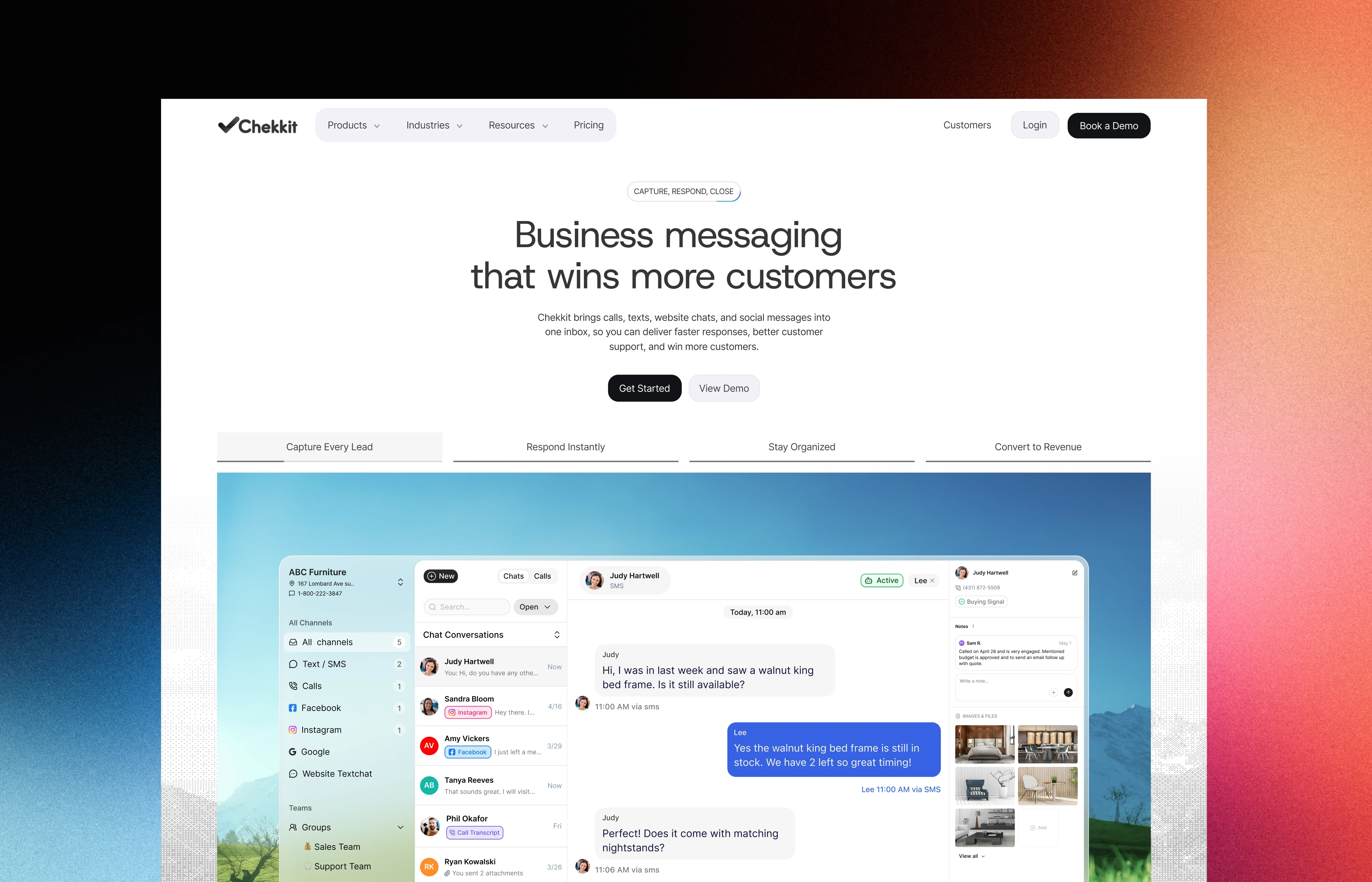
Hero section of the home page being centred around Business Messaging

Nothing was deleted. Seven things were demoted.
We still wanted to keep access to the entire suite of features Chekkit offered, however with favourability towards the core features that brought them and their customers the most results.
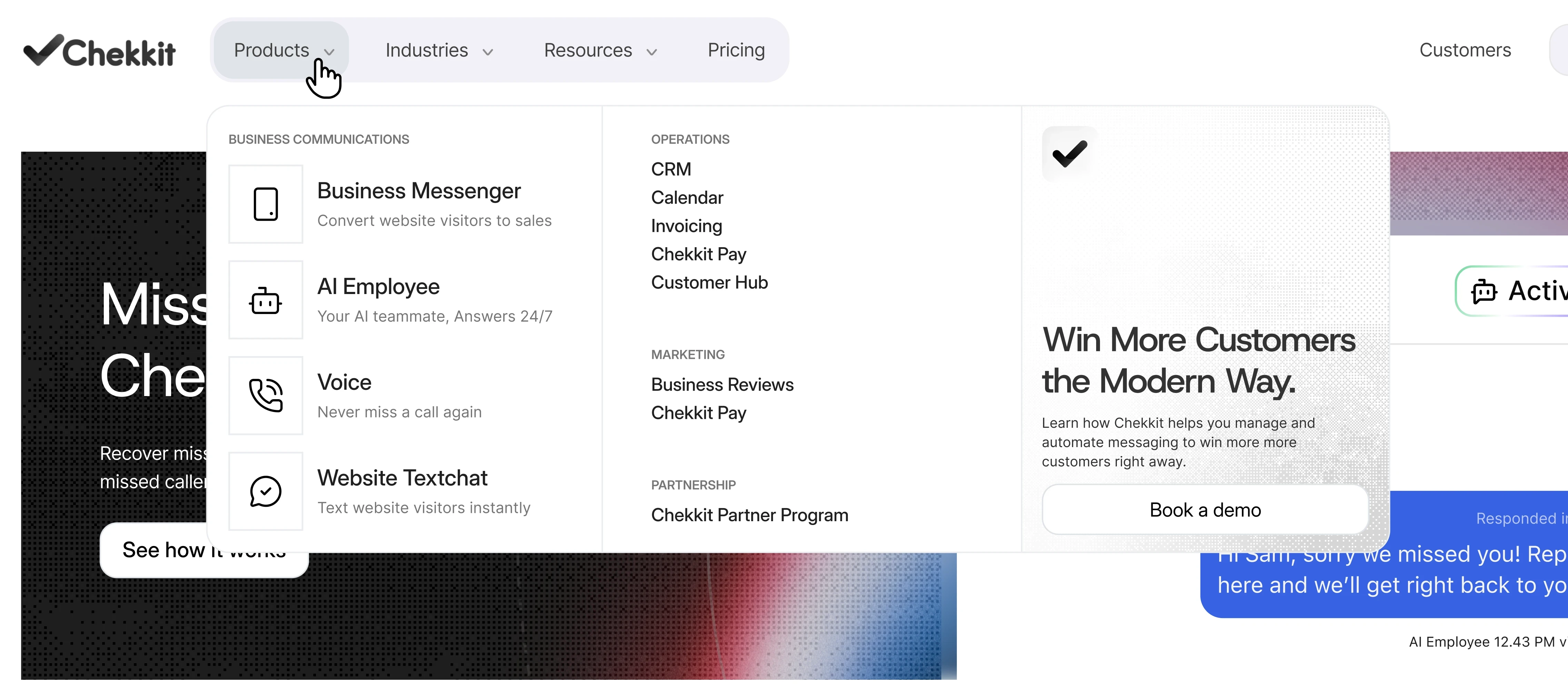
We did this through grouping complimentary features under "operations" and "marketing" through a list within the navigation. For the core features, they were made more prominent under their own "business communications" column.
Solution
Emphasize core features in nav dropdown. Demote smaller features into less prominent nav links.
Animations that communicate faster than text
I worked on UI animations to show the product working visually to give users the look and feel of using Chekkit. Many of the animations communicate messaging that comes across better visually rather than showing text.
These animations breathed life throughout the site and gave users better scanning to understand Chekkit rather than investing time reading the texts.
Examples:
Freeing up team time
Shows questions arriving and resolving themselves, without the viewer seeing the machinery. That's the claim, it runs in the background and you don't have to watch it.

Getting calls through Chekkit
By using familiar IOS call interphases, we are able to communicate how Chekkit falls right into familiar digital environments by working with native mobile components.

A shared inbox made literal
A call comes in, three teammates ring at once, one picks up. Shared inbox can be an abstract idea when read. This is why I created this animation to help see it happen in action.

Omnichannel
shown by cycling the real dashboard through each channel rather than describing it. The dashboard graphics were rebuilt from scratch for the site.

Where I failed and what I would do differently
Initially, I designed the app to connect directly to apple's wallet app to track expenses. The idea was based on the app only visually keeping track of spendings and auto categorizing them as the user spends during day to day living.
After spending time designing around this mechanism, we discovered the app store's guidelines are tight and access to apple's IOS wallet app would be nearly impossible. We had to quickly rethink how to change our app to fit this constraint.
I came up with the 2 new methods mentioned above; taking pictures of receipts or describing the expense in natural language to a chat interphase for the app to analyze. Although these are less than perfect solutions, they are the best we could think of based on our constraints. Moving forward, I would better research feasibility of features before designing around it.

Annotated handoff. Search results at 15″ and 13″, with max-widths, sticky behaviour, and card constraints documented in the file.
“On a constrained product, verifying the constraint is the first design task, not a validation step at the end."
Designing an ending, not a funnel
As stated in the case study and multiple times inside our app, OnePay is not meant to give financial advise and is not meant to fully replace financial managers. Its designed to give users financial literacy and guide them to better overall financial health and habits.
The app ends its function here and gives users all the tools they need to meet a professional financial advisor and take their finances to the next level. OnePay delivers the report needed as the first step to financial management, and gives you rough guidelines to follow and stay on top of financial plans.
Where the app ends
OnePay helps users learn better financial habits and nudge themselves towards better financial management. They will have all the tools they need to meet a professional advisor and take finances to the next level.